"By releasing your chart, instead of meaningfully educating the public, you [the GOP] willfully obfuscated an already complicated proposal. There is no simple proposal to solve this problem. You instead chose to shout "12! 16! 37! 9! 24!" while we were trying to count something.
So, to try and do my duty both to the country and to information design (a profession and skill you have loudly shat upon), I have taken it upon myself to untangle your delightful chart."
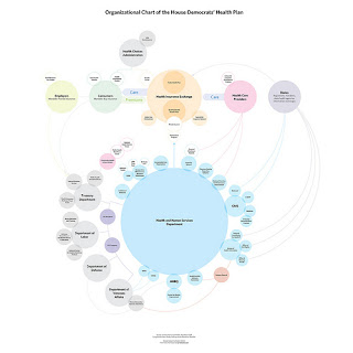
His version: (click photo to view his original posting. pdf of just the chart is here.)
OOOOHHH. It makes so much more sense now. I'm glad we got that cleared up.
What the hell? What, because they're circles instead of rectangles, and the lines aren't all pixellated, that's supposed to make this bill easier to understand? The bill is still CRAP. This chart might be pretty, but look how many freaking bubbles there are! There are too many freaking bubbles! Look at how many people have a hand in our health care system under this proposal. Count. Tell me how many bureaucrats, lobbyists, committees, officiaries, advisory panels, and analysts are involved in this. What is the percentage of actual medical personnel? Where do voters come in?
The bill is badly designed. No graphic artist is going to fancy it up and make it pretty, it's UGLY. It's a final paper written the night before it's due, and Obama is the bad friend saying, "hurry up and finish, we've got drin- ...er... spending to do!"
p.s. I love you, Topher, and thank you for sharing that. I really am interested in seeing different takes on this.
2 comments:
Ha, I don't understand either chart actually. I think this one would be easier to read if I knew what the hell I was looking at.
I don't think that just because something is complicated means it's bad. Of course it's going to be complicated. It's not like individual health insurance policies aren't confusing as hell as it is.
complicated isn't bad. government complicated can be ridiculous. have you seen our tax code lately? and like i said, if individual health insurance policies are so complicated, why can't we learn from them and streamline a government policy? why do we have to have so many damned bubbles?
urg. there is more i have to say, i'm going to post things in increments. i would appreciate comments from you and matt, as i'm also trying to understand this massive change in policy. bleargh.
Post a Comment